Home is more than just a shelter — it is where we seek peace, comfort, and restoration. While furniture, layouts, and lighting all contribute to how a home feels, colour is the single most powerful element in setting mood. The right palette can calm the mind, reduce stress, and make everyday life feel lighter.
At Studio Mavi, we believe in creating interiors where colours aren’t just decorative but deeply connected to emotions. In this guide, we explore the most soothing colours for home interiors that help cultivate serenity and balance — the kind of hues every tranquil home deserves.
1. The Psychology of Soothing Colours
Colour psychology tells us that shades have a direct impact on how we feel:
- Cool tones (blues, greens) tend to relax and refresh.
- Warm muted tones (beige, taupe, blush) provide comfort and warmth.
- Neutral tones (white, grey, cream) act as grounding backdrops.
A 2023 study published in the Journal of Environmental Psychology found that calming colours can reduce perceived stress by up to 32% in residential spaces. This underlines how important colour selection is when designing homes.
2. Soft Blues: Evoking Calmness of Sky and Sea
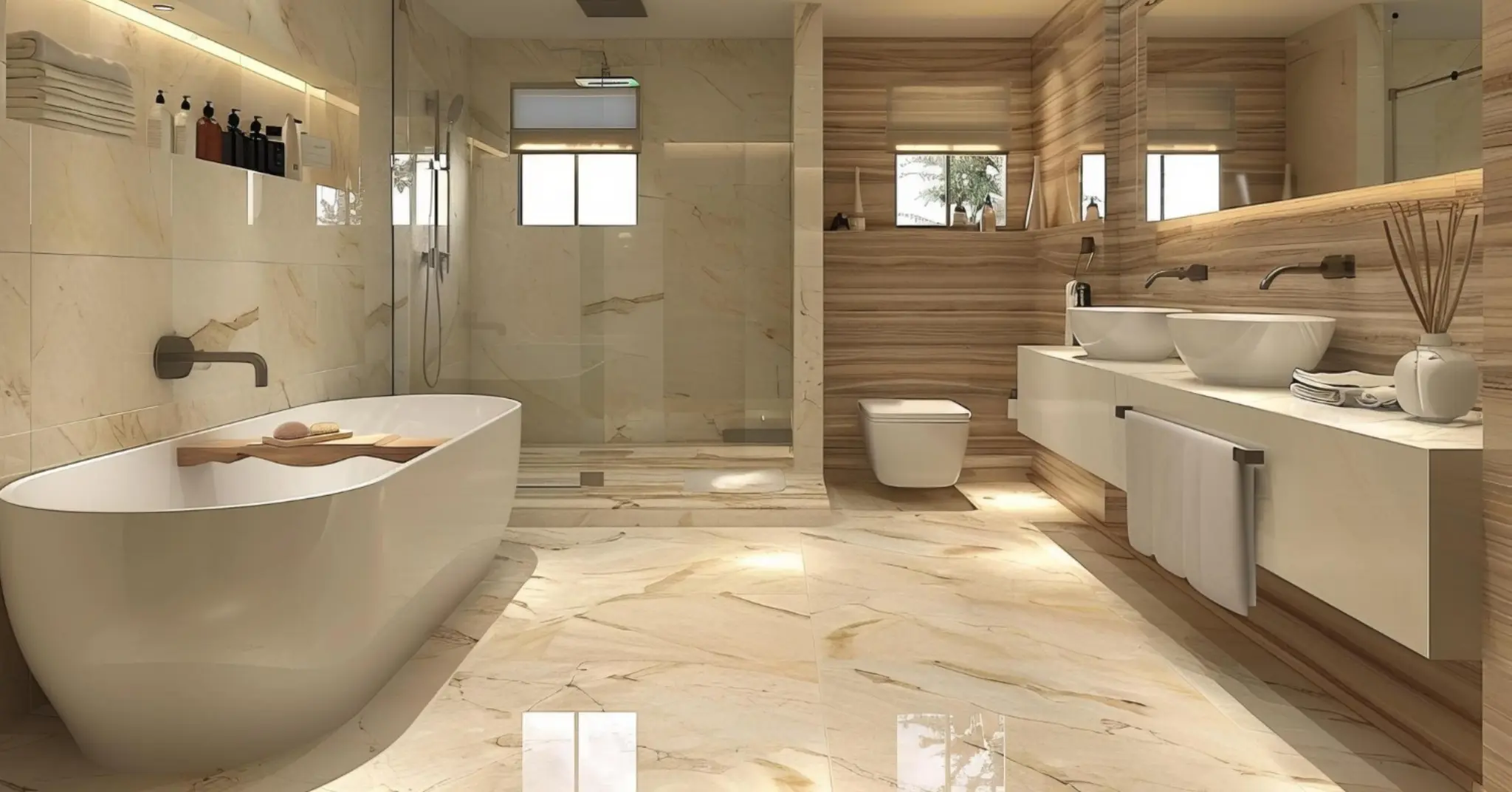
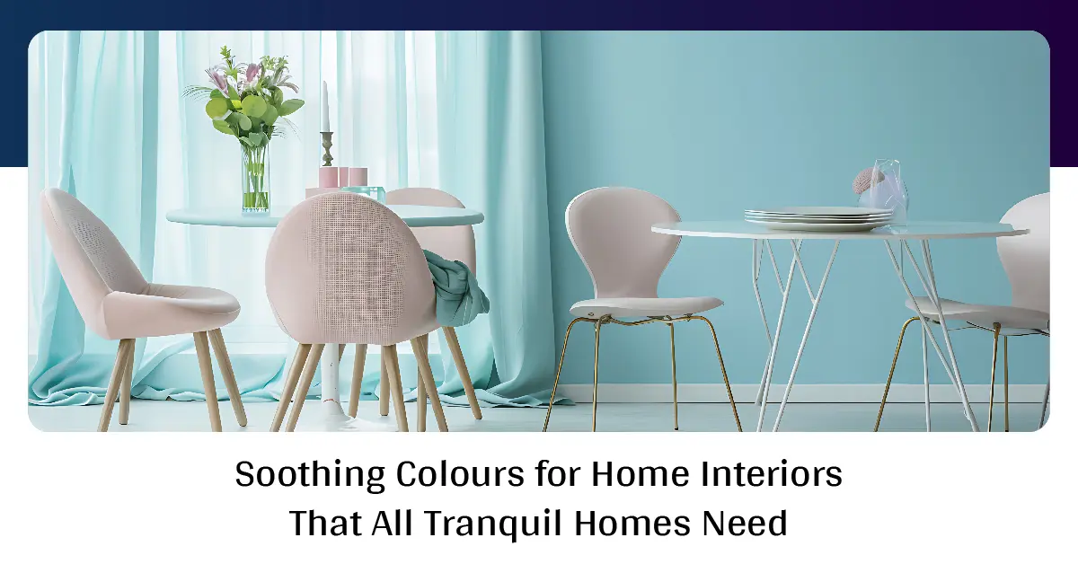
Blue has always been associated with tranquility and stability. Pale, misty blues or muted aqua tones instantly bring a sense of calm, making them ideal for bedrooms and bathrooms.
Design tip: Pair a powder blue wall with white trims and light wooden flooring for a coastal-inspired, airy feel. To prevent cool tones from feeling too stark, add soft textiles like linen curtains or plush rugs.
Where it works best: Bedrooms, study corners, bathrooms.
3. Sage Green: Nature’s Own Neutral
Green is the colour of renewal and growth. Sage — a muted, grey-green shade — has become a design favourite for its ability to be both soothing and versatile. Unlike brighter greens, sage feels restful and blends seamlessly with wood, stone, and natural textures.
Design tip: Use sage for kitchen cabinetry or living room walls, and complement with natural jute rugs and indoor plants. This creates a biophilic atmosphere, aligning with the popular “let nature in” design trend.
Where it works best: Kitchens, living rooms, study areas.
4. Soft Beige and Taupe: Warm Minimalism
Beige and taupe are timeless choices that create warmth without overpowering the senses. These hues serve as perfect backdrops for layering textures and colours, and they never feel overwhelming.
Design theory link: The principle of harmony suggests that neutral tones unify varied décor elements, making a space feel cohesive and calm.
Design tip: Pair taupe walls with matte black light fixtures for a modern edge, or with warm wood for a rustic charm.
Where it works best: Living rooms, entryways, open-plan spaces.
5. Gentle Pinks and Blush Tones: Subtle Comfort
Far from being overly sweet, modern blush tones are soft, sophisticated, and nurturing. These muted pinks radiate warmth and can subtly brighten spaces without feeling bold.
Design tip: Use blush in textiles like cushions, throws, or accent walls. Pair with grey or cream for balance. Metallic accents like brass lamps add luxury without disturbing the softness.
Where it works best: Bedrooms, nurseries, quiet reading corners.
6. Creamy Whites: Light and Spacious
Pure white can sometimes feel clinical, but creamy whites and off-whites are timelessly soothing. They expand space, bounce light, and create an open canvas that highlights furniture and art.
Design tip: Use creamy whites with warm undertones in spaces that get natural light. Layer with wood, linen, and woven textures for coziness.
Where it works best: Living rooms, dining rooms, small apartments.
7. Light Greys: Understated Elegance
Grey is often misunderstood as cold, but soft, warm greys create understated elegance while soothing overstimulated minds. Grey’s neutrality allows it to pair with almost any colour accent.
Design tip: Use grey walls in living spaces, and pair with pastels like blush or sage for depth. Textures like boucle or velvet in furniture add softness.
Where it works best: Modern apartments, home offices, hallways.
8. Earthy Terracotta and Clay: Grounding Warmth
For those who prefer warmth, earthy shades like terracotta or muted clay evoke a sense of grounding. These tones mimic natural soil and stone, making spaces feel safe and comforting.
Design tip: Terracotta feature walls paired with natural wood furniture create Mediterranean charm. Add soft ivory drapes to lighten the palette.
Where it works best: Dining rooms, patios, creative studios.
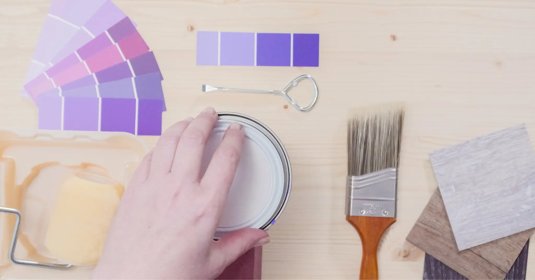
9. Lavender and Lilac: Serenity with a Hint of Luxury
Soft purples like lavender bring serenity while adding a subtle touch of luxury. Unlike deep purples, which can feel heavy, pale lavender balances femininity with sophistication.
Design tip: Pair lavender walls with silver or brushed gold accents for elegance. Use as an accent in bedrooms or meditation spaces for a calming effect.
Where it works best: Bedrooms, meditation rooms, bathrooms.
10. Combining Soothing Colours the Right Way
Choosing calming colours is not just about picking one shade but creating a palette. Here are some expert-approved combinations:
- Blue + White + Natural Wood: Coastal calm.
- Sage Green + Beige + Cream: Nature-inspired harmony.
- Grey + Blush + Brass: Modern softness.
- Terracotta + Ivory + Olive Green: Warm Mediterranean mood.
Pro tip: Follow the 60-30-10 rule — 60% dominant colour (walls), 30% secondary (furniture/upholstery), and 10% accent (decor/accessories). This keeps balance intact.
Why These Colours Actually Work
Each of these hues ties back to either nature-inspired palettes or muted tones that reduce visual overstimulation. They work across design styles — minimalist, modern rustic, or bohemian — because they create calm foundations that can be layered with bolder accents if desired.
Interior design is as much about emotion as it is about function, and soothing colours strike the perfect balance.
Final Thoughts
In today’s fast-paced world, our homes must act as sanctuaries of peace. By thoughtfully incorporating soothing colours like soft blues, sage greens, blush pinks, and earthy neutrals, you can craft interiors that relax the mind and refresh the soul.
At Studio Mavi, we help you discover palettes that go beyond trends — creating spaces that reflect your personality while promoting balance and serenity. Whether you’re refreshing a single room or reimagining your entire home, the right colours can truly transform your everyday life.