The dining room has always held a special place in the home — a setting for conversation, celebration, and connection. It’s where design and emotion intersect most intimately: the clink of cutlery, the laughter of guests, the soft wash of evening light against a beautifully painted wall.
In 2025, dining room design is less about grandeur and more about atmosphere — spaces that invite slow living, mindful meals, and effortless style. And if there’s one element that can transform that experience almost instantly, it’s your wall colour.
Wall paint isn’t merely a background; it’s the tone-setter, the silent host that frames every meal and every mood. In this guide, we explore the art, psychology, and craft of choosing dining room colours that inspire conversation, appetite, and harmony — with the expert eye of Studio Mavi’s design philosophy.
The Power of Colour in the Dining Space
Colour in a dining room is far more than aesthetic. It affects how we perceive space, light, and even taste.
- Warm tones (terracotta, sienna, and ochre) create intimacy and appetite.
- Cool tones (sage, dove grey, powder blue) lend calm and sophistication.
- Neutrals (beige, taupe, bone white) make art and furniture stand out.
A study published in the Journal of Environmental Psychology found that colours with warm undertones can actually stimulate appetite and sociability, which explains why many restaurants still embrace deep reds and golden neutrals.
In residential design, the goal is subtler — to evoke comfort, not hunger; to create rooms that feel both elegant and lived-in.
Step 1: Start with Light and Architecture
Before selecting a shade, study your space’s natural light, wall proportions, and ceiling height.
- North-facing dining rooms often need warmer hues to compensate for cooler light — think muted coral or sandy beige.
- South-facing rooms benefit from cooler tones like sage or French blue, balancing abundant sunlight.
- Smaller rooms open up with soft neutrals or eggshell finishes that reflect light.
- Larger rooms can handle deeper tones like olive, rust, or charcoal, adding intimacy and definition.
The paint finish matters too. While matte paints create depth and hide imperfections, eggshell and satin finishes reflect just enough light to make walls glow softly during candlelit dinners.
Step 2: Choose a Mood, Not Just a Colour
Every great dining space begins with a moodboard, not a paint sample. Ask yourself: how do you want people to feel when they sit here?
a. Elegant and Understated
Choose pale grey, ecru, or mineral tones. These hues act like linen — quiet yet sophisticated. Add accents in brushed brass or warm wood to create tactile luxury.
b. Warm and Earthy
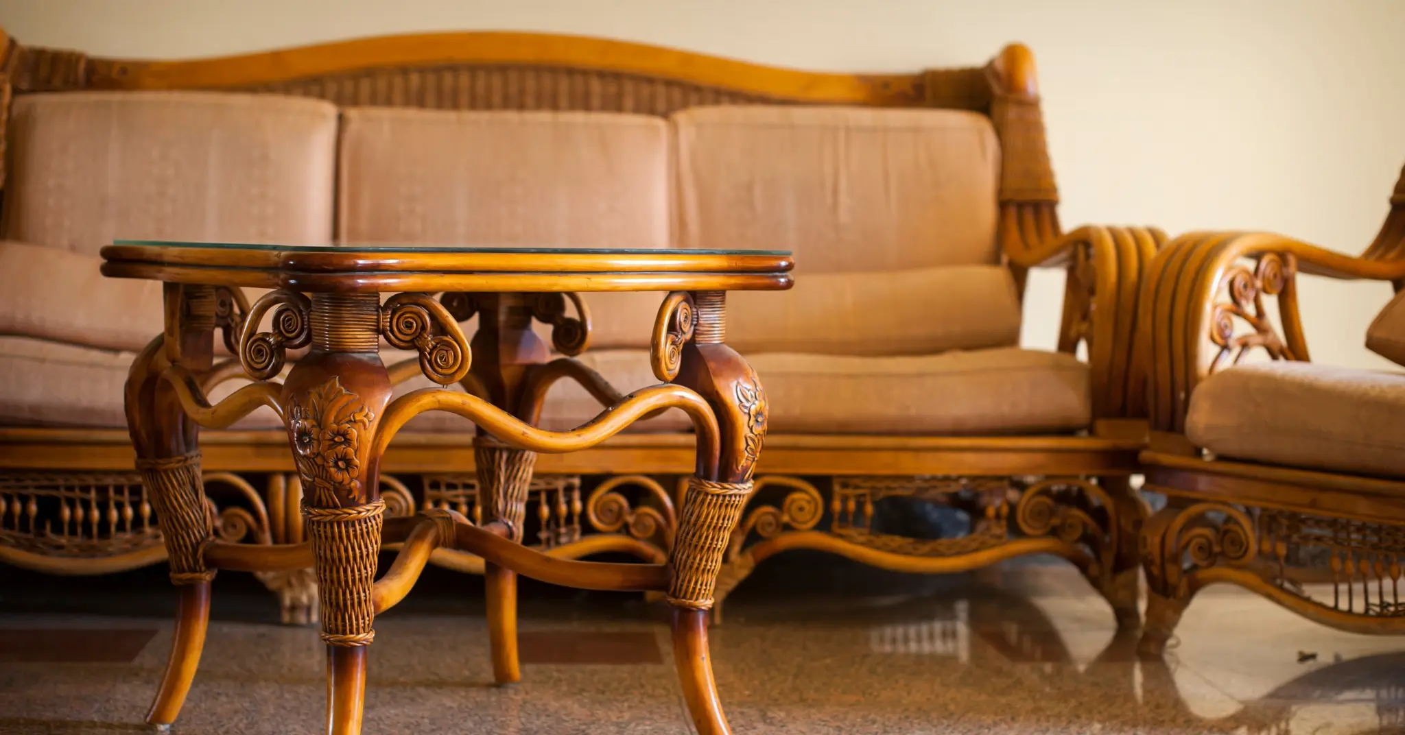
Terracotta, burnt sienna, and olive tones recall Mediterranean courtyards. These colours pair beautifully with natural textures like cane chairs, linen tablecloths, and ceramic dinnerware.
c. Dramatic and Expressive
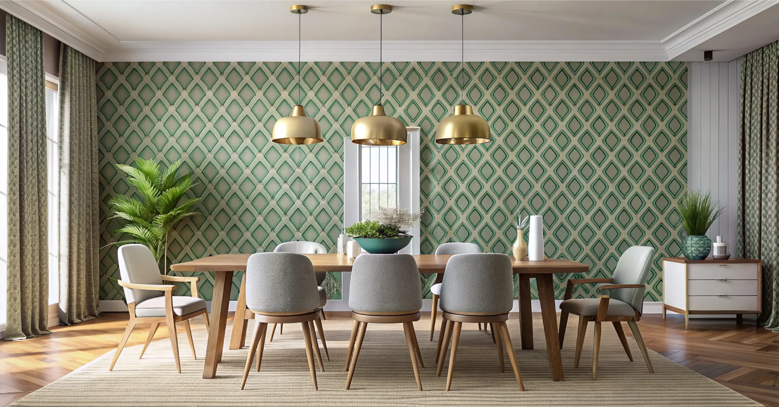
Deep emerald, navy, or charcoal create striking backdrops for art or lighting. The key is balance — lighter ceilings, ample light, and metallic or glass accents prevent heaviness.
d. Fresh and Airy
Pale sage, sky blue, or muted coral can make smaller dining rooms feel inviting yet light. These are hues that blend seamlessly with greenery or natural sunlight.
Step 3: Create Layers with Paint Techniques
The most memorable dining rooms don’t rely on a single flat tone — they use texture, layering, and craft.
- Two-Tone Walls: Paint the lower half in a darker hue and the upper in a lighter tone. This architectural division visually raises ceilings and adds depth.
- Limewash and Mineral Paints: The soft, cloudlike finish of limewash creates timeless texture. Perfect for those who want a rustic yet refined feel.
- Ombre Walls: A gradual fade from one shade to another can make a small dining nook feel ethereal.
- Accent Arches: Paint a curved form or niche behind a console or mirror to add sculptural focus.
Such painterly techniques nod to architectural finesse — simple but layered, like the brushstrokes of a Renaissance fresco adapted for modern life.
Step 4: Pair with Complementary Elements
Colour rarely stands alone; it speaks to materials, textures, and light. A successful dining room palette balances all three.
- Furniture: Darker walls look striking with mid-tone wood (teak, walnut) or upholstered chairs in natural linen. Lighter walls work well with deep wood accents for contrast.
- Lighting: As explored in our previous blog, dining spaces thrive on layered lighting — overhead pendants for focus and concealed profile lighting for atmosphere.
- Art and Accessories: Use art to either contrast or echo your wall colour. Brass frames and mirrors amplify warmth, while black accents anchor lighter palettes.
- Greenery: A potted fiddle-leaf fig or eucalyptus vase introduces life and texture. Nature is the best colour accent.
Step 5: Think Beyond Paint — Colour as Architecture
The dining room wall can also become architecture through strategic colour placement.
- Highlight architectural mouldings, wall panels, or arches in complementary tones to celebrate craftsmanship.
- Extend paint to the ceiling in the same hue for a cocooned, enveloping look — ideal for intimate dining zones.
- Alternatively, paint window trims in a contrasting shade to frame outdoor light like a living picture.
These details make the space feel architecturally intentional, not just decorated — a distinction that defines refined interiors.
Step 6: Balancing Heritage and Modernity
Pune’s heritage homes, with their high ceilings and teak trims, offer a unique canvas for colour. Rather than erasing those details, use paint to highlight them.
- For wadas and colonial-style homes, choose dusty pastels and muted neutrals that respect original architecture while feeling contemporary.
- For modern apartments, experiment with jewel tones or deep greens for a rich, urban edge.
This fusion — where vintage architecture meets modern colour sensibility — is at the heart of Studio Mavi’s design philosophy. Every wall tells both an old and new story.
Step 7: The Art of Lighting and Finish
Lighting determines how paint lives on your walls. A warm white LED (2700K–3000K) enhances reds, beiges, and browns, while cooler white light (4000K+) flatters blues and greys.
Natural light changes throughout the day — what feels warm at sunrise may turn cool at dusk. That’s why sample swatches are vital. Paint a 2×2 ft patch and observe it across morning, afternoon, and evening light before deciding.
For finishes, matte paints bring elegance and hide imperfections in heritage homes; satin finishes add sheen for contemporary spaces. Glossy finishes, though rare in dining areas, can dramatize accent details like chair rails or wainscoting.
Step 8: Trend Forecasts for 2025 Dining Room Palettes
Studio Mavi’s 2025 colour forecast leans toward organic, grounding hues that echo nature:
- Moss Green: Balanced, nurturing, perfect for wooden furniture.
- Cinnamon Brown: Warm, appetizing, ideal for cozy dining corners.
- Clay Terracotta: Earthy sophistication with soft lighting.
- Muted Indigo: Contemporary serenity for statement walls.
- Ivory Cream: Timeless, adaptable, and luminous.
These palettes reflect a design shift towards calm luxury — spaces that soothe, not shout.
Final Thoughts: Dining as a Designed Experience
A beautifully painted dining room is more than a backdrop for meals — it’s an experience of light, colour, and memory. The way sunlight falls on a terracotta wall at breakfast, or how a sage-green hue glows under pendant lighting at night, changes how we inhabit a space.
Great design doesn’t stop at visual harmony; it nurtures emotion. It creates a setting where meals become rituals, and walls become witnesses to laughter, conversation, and belonging.
At Studio Mavi, every colour we choose, every wall we paint, aims to tell that story — one of balance between artistry and authenticity, architecture and feeling.
So, the next time you pick up a paint swatch for your dining room, don’t just look for a shade. Look for a mood — one that feels like home, illuminated by everything you love.